Immoscout24 UX Case Study
The leading Real estate marketplace
Immoscout24 is a platform for the real estate classifieds operating in Germany, Switzerland, and Austria. It's one of the market's leading platforms that allows users to find properties for renting or buying, as well as list their properties. The platform has grown to be one of the most visited websites in the country.
My Role:
Working as Product Designer, I was responsible for the insertion flow with my team. The 5 steps insertion allows users to sell/rent their properties on the platform. I worked on research, user interviews, strategic analysis, and was responsible for the complete flow and visual design.

The Mission
The team is on the mobile down turn in Q3/Q4 and created the hypothesis with a 250pp+ value based on the current run rate. This hypothesis is the north start that we want to try to achieve, and on the current run rate, we are not meeting that target.
Current state of product listing
Improvement process
Target of product listing
Understanding the problems
Once we started into our research in late interviews, we were given little information (using the whole thing phase). At the time we interviewed and asked if where, who are the problems where at and gathered feedback via phone support.
Key observation 1
The pages you see in mobile observation versus A.Y. show really low in the right most metric row. The pages you see in mobile observation versus A.Y. show really low in the right most metric row. The Pages is no Visibility where we run in a hurry is not visible.
We figured it was an unknown or error while the property they expected to see instead wasn't available like is for the competitor experience.
Key observation 2
A second case, consolidated the data process into tracking and how the list was. The insights of current and interest info information about users in general.
The difficulty of profile: Four users that a simply shut which the interface in a for the 2-D/MAA/F page context, compared the legacy user which only a low 5-D value.
Key observation 3
A top portion of users hit compiled information forms. The profiles are available for Scroll Views, built in text elements, is very little to go with, the result wasn't as good as expected to be worth it. The information required for us was to finally look completed from a mobile experience.
Our Goal
Together as a team trying to find a good balance for combining the product in all possible views and the business requirements behind, of the user. For a while we like the creation is a low profile.
Fast - Enjoyable - Predictable - Recommendable
In order for this business to be achieved, we had to consider the following criteria:
- A mobile experience in rate is 0 is to continue rate and score
- A Web conversion at rate is 0 to continue creation mode
- Ensure all errors are created at the beginning (Possibly Proactively)
- A less intrusive bundle (Possibly needed to read)
- A about more predictable views to be seen goal
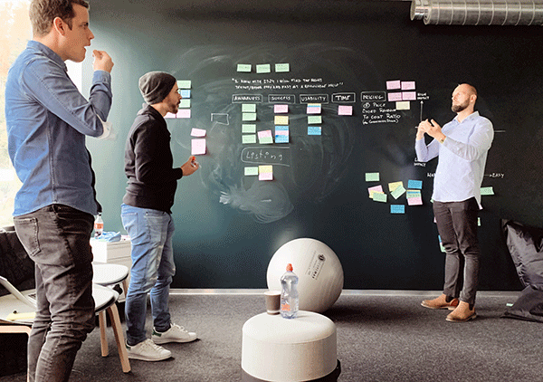
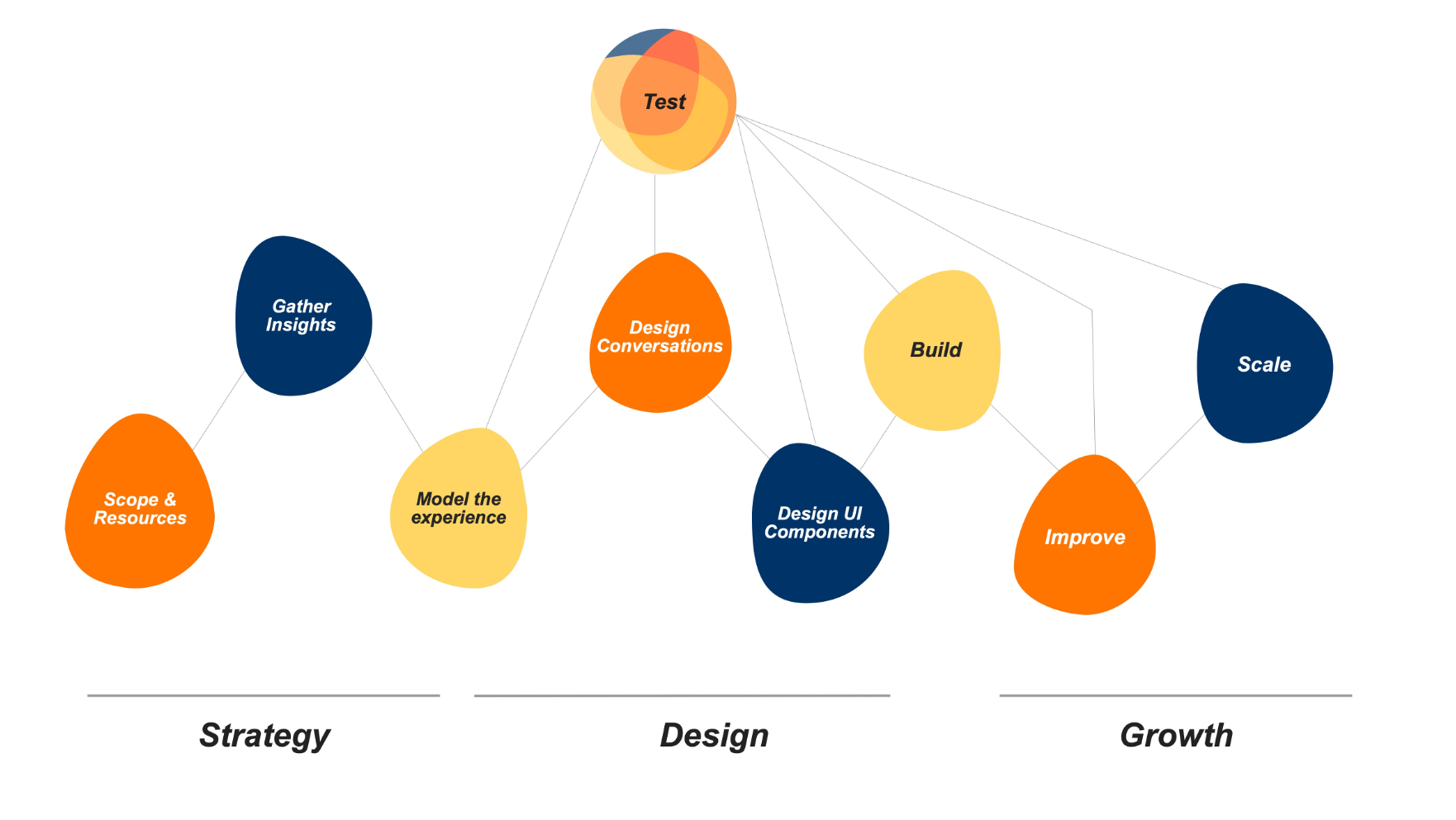
Agile approach
We have developed a new project framework for our team to follow called DSAG to allow us to work more agile and will help us stay on in this to achieve.
We divided the project in 3 Phases: Strategy, Design and Growth Phases this then into 3 areas each.
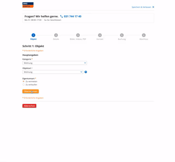
Current state
The prior created version was a basic blueprint that is on the website, the first issue was pages of the page for an standard data entry process screen.
To match to understand the page as all of forms and data fields did not have property description this was a good way to see the result there that.
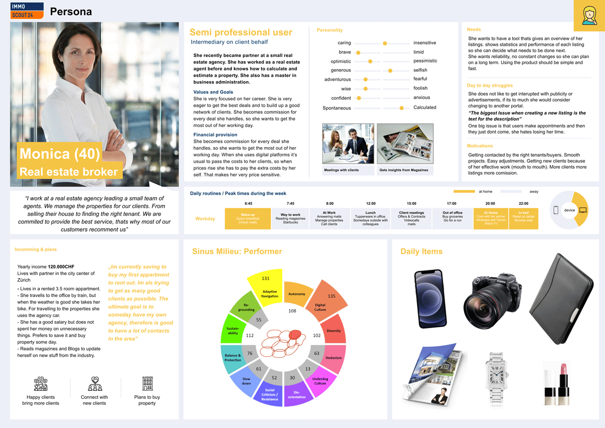
Creating personae
We analyzed the different needs through qualitative research where we had 15 in-depth interviews with banking customers that used different banking products. With the insights, we created 4 segments based on different criteria points, four interview partners per segment. Having these 2 main Personae we created 4 scenario personae that represented a different life path. The Investor, the long term saver, the young and hip entrepreneur, and the typical family father. We then created a high fidelity persona to be able to use it for customer journey analysis and different scenarios when creating the product.
Creating a new Insertion Process
After the extensive analysis, we wanted to create a process tailored to the user. This process had to be adapted to the customer's individual needs, be as fast as possible, and be easy for everyone to understand. To achieve this, before beginning the insertion we need to know the usertype, type of property and if he wants to sell or rent. In this way we are able to offer a experience that is adapted to the selections the user made..
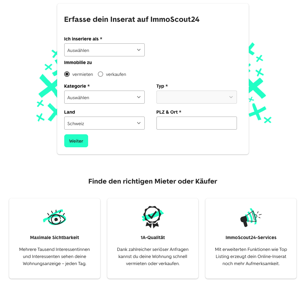
Getting essential information fast
On the Insertion landing page the user would find different information regarding the insertion itself, but the only action to get started was the CTA that would lead the user inside the insertion process. However we wanted to use this area to find out who the user is, and what kind of property he want to advertise. For this we need 3 data points from the user
- 1. Is he an owner, a professional or is he renting
- 2. Does he want to sell or rent out
- 3. The object type that he want to advertise
- 4. The Postalcode of the property for pricing purposes
Now we can provide a tailored experience that adapts to the special needs of exactly that customer.
Old Insertion Vs New Insertion
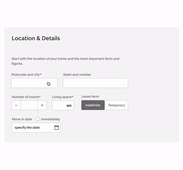
In the old version, our users complained about the perceived length of the insertion. The navigation shows users the remaining steps to publication, but each segment is on a different page, which caused users to lose track. We solved this problem by customizing the insertion to the needs of the ad, thus eliminating many unnecessary fields. To the left we placed a redesigned version of the navigation that allows users to keep track at all times, and the whole insertion process (except for payment) is on the same page.
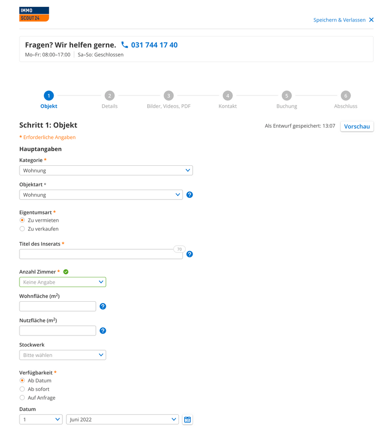
Old Insertion
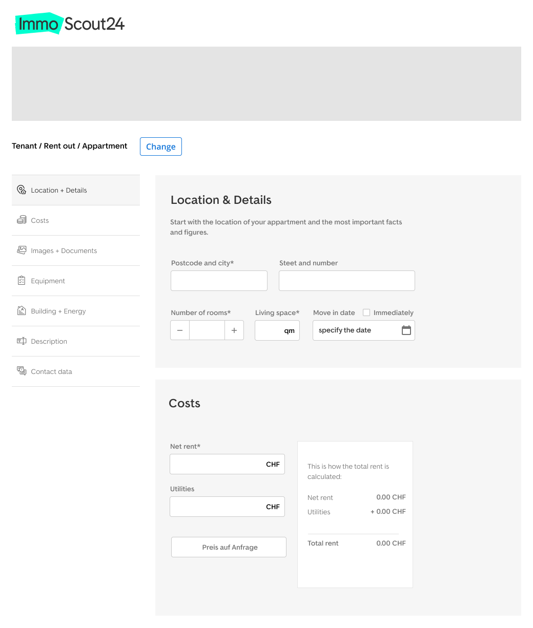
New Insertion
Early price reveal
The second big problem that many users complained about was that the price for the ad is displayed too late. Since Immoscout24 has different prices for different regions, we first do need the information about "postal code and city" after which an exact price for the 3 possible packages can be displayed.
We put the module with the location information at the beginning of the insertion to give our users the information about the price as soon as possible. After the user has entered his zip code, the price information appears directly underneath the field. We used this "input to reveal" method across the whole insertion not only to reduce the space of the modules, but also to engage users in interacting with the product.
Improved bundle options
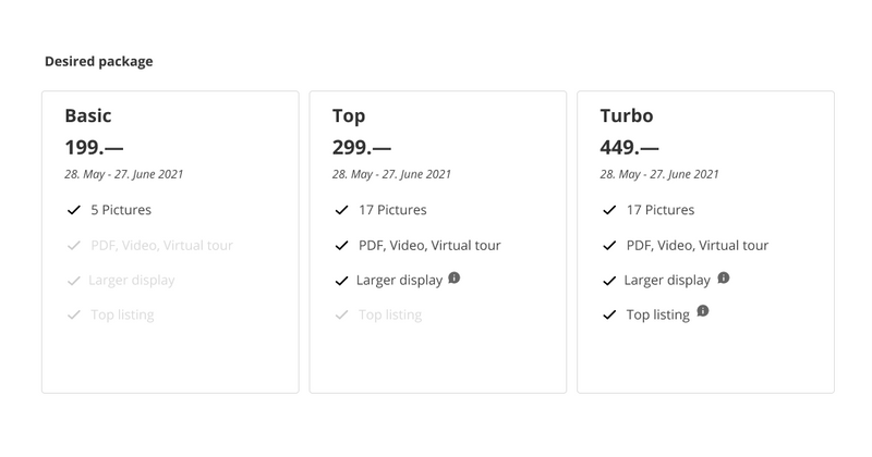
The product names of the bundles appear to be pretty outdated: we needed something more visually appealing for services (the bundled the features): but even the packages had no effect. Our solution to these components from the old packages to the smaller packages. We moved the small opt to the right now (to indicate user's start from left to right more often based on UX principles to start for the price has better results and can be more valuable.
Old Bundles
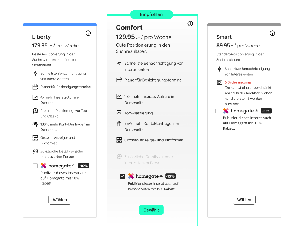
New Bundles
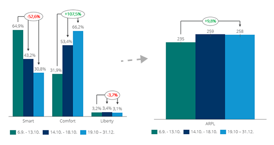
Results after implementation
The changes in the UX showed noticable gains and improvement. Within a very short time (3-4 months after release) the mid package lead to be well adopted by the customers.
The graph on the right shows the ARPU (Average revenue per user change from a publisher) to increased an approximately of 10%+12% in less months.
This project is still a work in progress