Rakuten Kobo Design System Case Study
Digital Reading
This project documents the merger of Rakuten Kobo and German tolino brands into a unified digital reading platform, positioning them as Amazon Kindle competitors. I led the Design System team across distributed international offices in Japan, Canada, and Germany.
My Role:
As Senior UX Designer and Design System Lead, my responsibilities included evaluating and merging two distinct digital products while implementing design consistency across geographically dispersed teams in Japan, Canada, and Germany.
Problem Statement
Working with teams spread across different time zones and continents presented significant challenges in maintaining consistency and alignment. Design decisions made in one office were often lost in translation or implemented differently in another. To overcome these synchronization barriers, we decided to create a unified design system that would serve as a single source of truth for all teams.
Darmstadt
Germany
Toronto
Canada
Tokyo
Japan
Design System Overview
Clarity
Eliminates ambiguity. Enables people to see, understand, and act with confidence.
Consistency
Creates familiarity and strengthens intuition by applying the same solution to the same problem.
Efficiency
Streamlines and optimizes workflows intelligently.
Organizational Structure
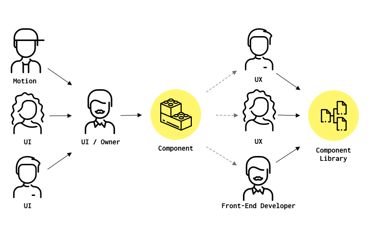
Design System Team
To maintain quality and consistency across all teams, we established a dedicated Design System Team that acted as gatekeepers for the single source of truth. This team was responsible for reviewing, approving, and integrating new components into the system.
We implemented a structured process where any new component had to go through a formal review before being added to the library. This included design review, accessibility checks, and documentation requirements. Using Git version control, we ensured that changes were tracked and could be rolled back if issues arose.
After discovering that deleting nested elements caused cascading failures throughout the system, this governance process became essential for preventing breaking changes and maintaining system stability.
Design System Team & Process
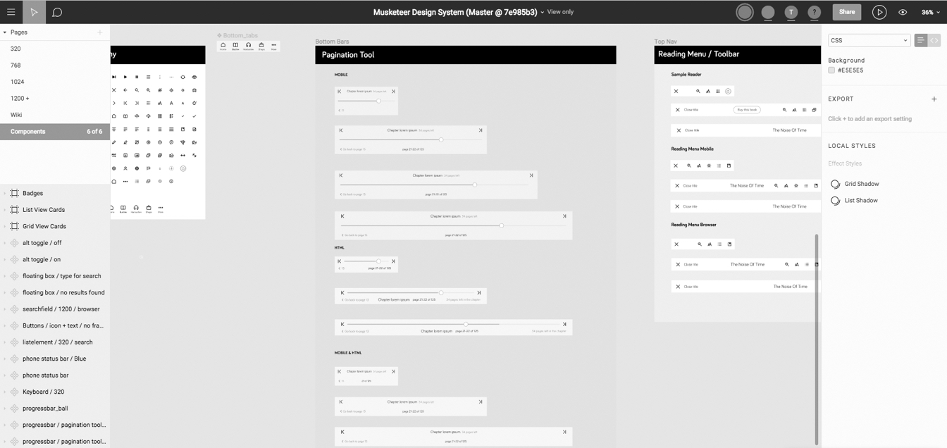
Atomic Design Component Layers
Atomic Design Principles
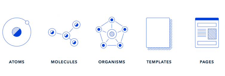
Inside the design system, we applied Atomic Design methodology to structure all component layers. This approach allowed us to build complex interfaces from simple, reusable building blocks while maintaining consistency across all platforms.
The hierarchical structure ensured that changes to foundational elements automatically propagated to higher-level components:
- Atoms: The smallest building blocks - icons, buttons, input fields, labels
- Molecules: Simple combinations of atoms - navigation items, search bars, sliders
- Organisms: Complex UI sections - headers, card grids, form sections
- Templates: Complete page layouts defining content structure
Design Thinking Workshop Findings
Research identified 15+ user pain points, including difficulty managing large libraries (1000+ items), poor content filtering and categorization, challenges with series/volume navigation, and regional reading preferences (right-to-left text, Manga formats).
Key Findings
- Progress bars displayed too small (50% user misunderstanding)
- Color-dependent badge visibility problems
- Unclear bookmark iconography
- Colorful UI didn't convey functionality to 70%+ of users
- Positive reception to percentage progress indicators
- List views preferred on mobile; adaptive cards on wider screens
- Bottom navigation outperformed hamburger menus
- Users favored predictable recommendations over random suggestions
Design Thinking Workshop
User Testings
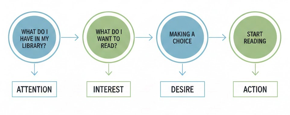
We conducted some user testing to explore potential solutions during the design process or test the waters during the product design cycle. But also to evaluate already existing products and take the results as a kickoff to improvement. Watching users try to accomplish tasks on the products is the most effective and efficient way to uncover usability problems that we might have.
User Testing Session
User Testing Results
Where we came from
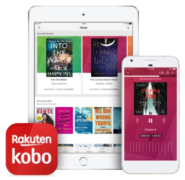
Because we had 2 apps we got insights on things that were performing better on one then on the other, kinda like an A/B test. Our new app needed a reading experience such as an Audiobook experience. The Tolino app was focused more on reading and had no great Audio experience, while Kobo's audiobook experience was great.
Main Card Tolino
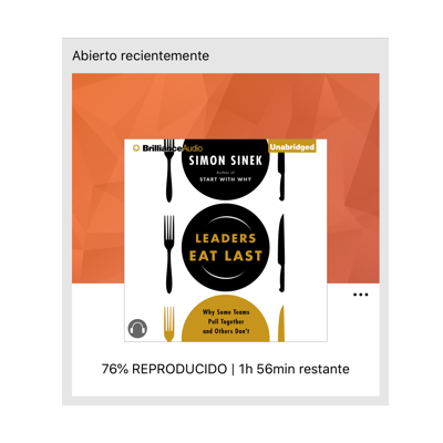
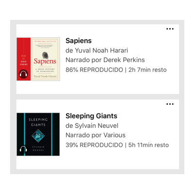
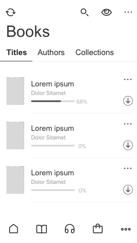
The Progress bar shows in to small and is not understood by 50% of the users. Some of the batches are problematic depending on the colors of the book cover. The Bookmark Icon is not understood
Main Card Kobo
The idea kobo had was shown a consistent very present color UI throughout the app, the functionalities where not recognized by over 70% of the users. What was well received was the % information of the book progress.
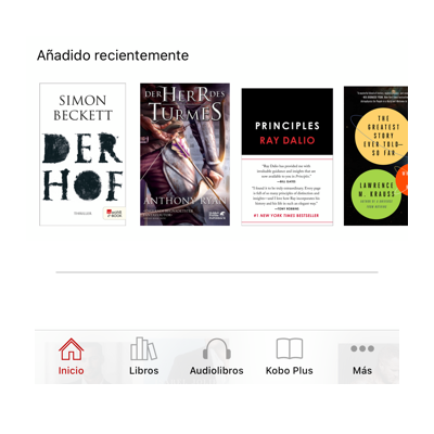
List elements
In the tests we learned that users prefer list elements on smaller screens, while on wider screens they prefer to have adaptive item cards.
Recos & Navigation
Book recommendations where random items. The Navigation was overall better received then the Hamburger menu.
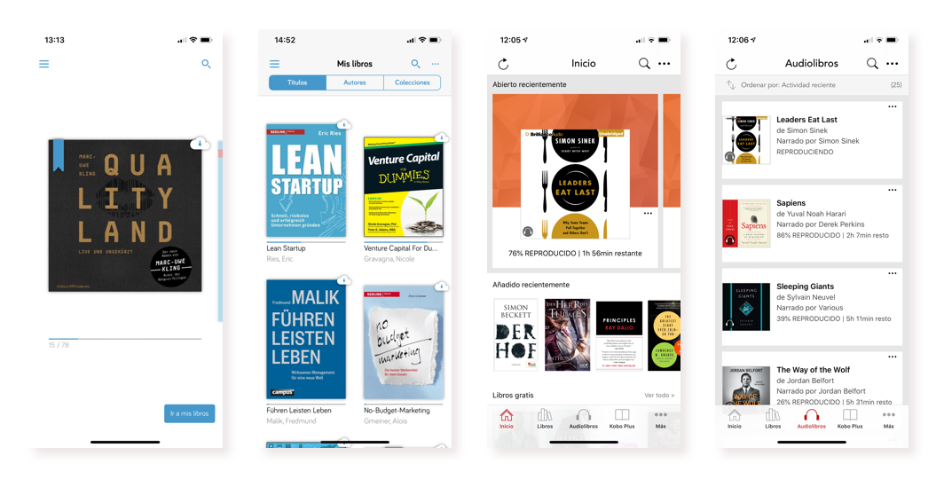
Starting from left 1. Tolino app home screen 2. Tolino book library 3. Kobo home screen 4. Kobo audiobook library
New UX
Working on the Keyscreens for the App we kept it simple but more informative. By introducing tags, the user now can see the status of his books. We also pursuit a scalable approach to the screen, having in mind that the code will be shared in the database, we had to keep it fully responsive.
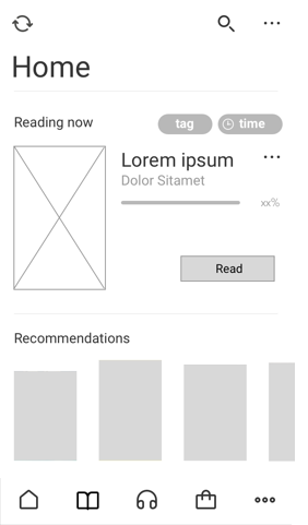
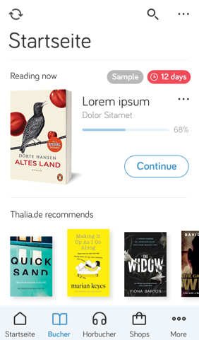
We introduced a new feature for borrowing books and created a new tagging system to show the current status of the library items. We went with the bottom navigation and worked on the recommendations to display titles based on the user's library items.
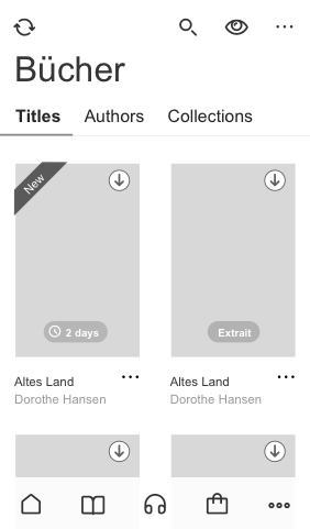
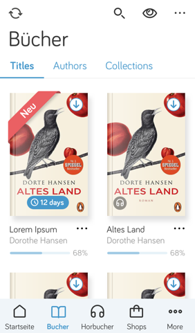
We learned that users don't click on "Filters" instead they want to jump from single items to their collections. We let Authors in the design because we don't want to overwhelm existing customers with a new experience. but gradually we would get rid of the "Authors" folder.
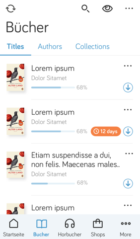
We had the hypothesis that users would only switch from grid to list view once in a while, we later found out that was not the case and implemented an extra icon for that in the User interface. You can see it in the ready-designed screens underneath.
Impact Results
Performance
- Significantly faster performance through database optimization
- Customer satisfaction regarding interface organization
Business Impact
- Notable conversion increases through streamlined in-app purchasing
- Identified need for region-specific Manga navigation adaptations